A dolomites painting does something few other wall art choices can: it commands attention without overpowering a room, bringing the raw grandeur of the Italian Alps into your everyday living space. Whether you're drawn to the flamingo-pink peaks at golden hour or the deep indigo shadows of a mountain dusk, mountain wall art has a unique ability to anchor a room both visually and emotionally — and the Dolomites collection is arguably the most striking example of alpine art available today.
Why Mountain Wall Art Works So Well in a Living Room
Mountain landscape paintings tap into something deeply human: the need for scale, perspective, and calm. Research in environmental psychology consistently links natural landscape imagery — especially vast, elevated scenes — with reduced stress and a heightened sense of wellbeing. In a living room, that effect is amplified because the space is where people decompress.
A large mountain painting also solves one of the most common interior design problems: the blank anchor wall. Unlike abstract art, which can feel ambiguous, or portraiture, which can feel intense, a mountain landscape painting is immediately legible and universally appealing. It gives the eye somewhere to rest and the mind somewhere to wander.
Among all alpine subjects, the Dolomites occupy a singular position. Their silhouette — jagged limestone towers rather than smooth rounded summits — creates a dramatic graphic quality that translates exceptionally well into print. At sunrise and sunset, the rock face turns shades of burnt orange, magenta, and dusty violet (a phenomenon locals call enrosadira), producing a natural color palette that is both warm and sophisticated. This is precisely why a Dolomites wall art piece feels curated rather than generic.
Choosing the Right Dolomites Painting for Your Interior Style
Not every mountain print suits every room. The key is matching the mood of the painting — its color temperature, level of detail, and compositional energy — to the existing character of your space.
Rustic and Chalet Interiors
Warm wood tones, exposed beams, and natural stone are natural partners for a sunset mountain print. The golden and amber hues in a Dolomites dusk scene echo the warmth of aged oak and terracotta tile. Choose a print with a natural wood or raw oak frame to reinforce the organic, grounded feel of the space.
Scandinavian and Minimalist Rooms
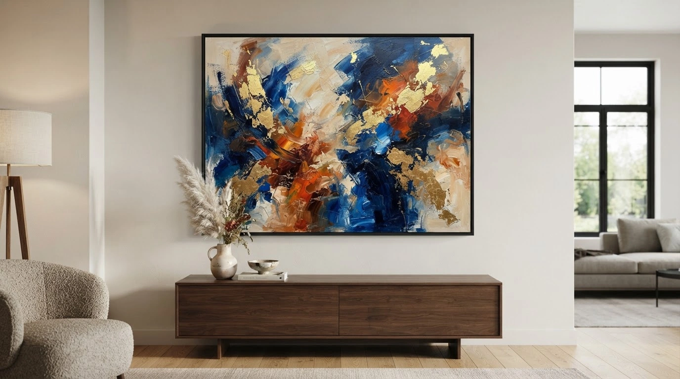
In a pared-back interior — white walls, light birch furniture, restrained accessories — a single large mountain painting becomes the undisputed hero piece. The contrast between the room's quietness and the painting's dramatic peaks creates exactly the kind of intentional tension that defines great Scandinavian design. Go frameless (gallery wrap) or choose a thin black metal frame to keep the composition clean.
Contemporary and Eclectic Spaces
Bold sunset colors — magenta, amber, deep violet — pair surprisingly well with neutral contemporary furniture. The trick is to let the painting carry the color story and keep surrounding pieces understated. An eclectic room can also handle a diptych or triptych mountain panorama, where the image is split across two or three canvases for a cinematic, gallery-like effect.
If you're looking for a curated starting point, Walensky offers a focused collection of Dolomites sunset prints in multiple sizes and formats, making it straightforward to find a piece that fits both your wall dimensions and your color palette.
Getting the Size and Frame Right for Your Living Room
Size is the single most common mistake people make when buying mountain wall art. A print that looks bold on a product page can disappear on a large wall — or overwhelm a small alcove.
The 60–75% Rule
Wall art should cover between 60% and 75% of the wall width above the piece of furniture it anchors — typically a sofa, console, or fireplace. If your sofa is 200 cm wide, your painting (or gallery grouping) should span roughly 120–150 cm. This is the single most reliable guideline in residential art placement.
Sizing for Different Room Scales
- Compact living rooms: One medium-format dolomites painting (around 40×60 cm) hung as a standalone focal point keeps the space from feeling crowded while still making an impact.
- Standard living rooms: A 60×90 cm or 70×100 cm canvas strikes the right balance — substantial enough to read from across the room, proportionate enough not to dominate.
- Large open-plan spaces: An oversized canvas (80×120 cm or larger) or a panoramic diptych is the right call. Anything smaller will simply read as a postage stamp on an expansive wall.
Frame Choices for Alpine Wall Art
The frame mediates between the painting and the room. Natural oak frames add warmth and work beautifully in rustic or Scandinavian settings. Black metal frames sharpen a contemporary or industrial interior. A gallery-wrap canvas with no frame — where the image wraps around the edges of the stretcher — reads as the most raw and modern option, and works especially well with large-format prints where the image itself is strong enough to stand alone.
Color Palette Matching: Making Your Dolomites Painting Sing
A dolomites painting typically carries four or five dominant hues: burnt orange and amber in the lit rock faces, dusty rose and magenta in the sky, deep indigo or steel blue in the shadows and distant ranges, and warm white in the snow and cloud. Understanding these tones is the foundation of successful color matching.
Warm Living Rooms (Terracotta, Ochre, Warm Beige)
A sunset Dolomites print amplifies and deepens an already warm palette. The amber and rose tones in the painting resonate with terracotta walls or ochre upholstery, creating a cohesive, enveloping atmosphere. This combination works particularly well in south-facing rooms with generous natural light.
Cool or Neutral Rooms (Grey, White, Sage Green)
Here, the warm tones of a dolomites painting do something more interesting: they create a deliberate, balanced contrast. Against a cool grey or white wall, the magenta and amber peaks appear to glow. This is one of the most effective ways to introduce warmth into a neutral room without repainting or reupholstering.
Using the Painting as Your Color Starting Point
Rather than trying to match a painting to an existing palette, consider reversing the process: choose the alpine wall art first, then pull one accent color from the print — a dusty rose, a warm amber — into the room's textiles and accessories. This approach guarantees harmony because every element shares a common source.
One thing to avoid: pairing a cool-toned, blue-dominated mountain print with warm red or orange walls. The color temperatures clash rather than contrast, and the result feels unsettled rather than dynamic.
Where and How to Hang Your Mountain Painting
Placement determines whether a painting integrates into a room or simply occupies space on a wall. For mountain wall art, three positions work consistently well in living rooms.
The Primary Focal Wall
Above the sofa is the most reliable position for a large dolomites painting — it creates an immediate visual anchor and frames the main seating area. Above a fireplace works equally well, especially in rooms where the chimney breast is the natural focal point. Hanging above a TV unit is possible but requires more care: the painting should be large enough that it doesn't compete visually with the screen.
Hanging Height
The center of the painting should sit at approximately 145–150 cm from the floor — roughly eye level for a standing adult. This is the standard used by most galleries and museums, and it works in residential spaces for the same reason: it places the visual midpoint of the image exactly where the eye naturally rests.
Gallery Wall with Mountain Art
A gallery wall built around a framed mountain art centerpiece can be highly effective if it's composed deliberately. Use one large dolomites painting as the anchor, then surround it with smaller complementary prints — abstract landscapes, topographic maps, or botanical studies in a similar color family. Keep consistent frame styles or finishes to unify the grouping. Limit the total number of pieces to five or seven to avoid visual clutter.
Common Mistakes to Avoid
- Hanging the painting too high — a frequent error that disconnects the art from the furniture below it.
- Choosing a print that is too small for the wall, which makes even a beautiful image look like an afterthought.
- Overcrowding the wall with too many pieces of similar size, which flattens the visual hierarchy and dilutes the impact of each individual work.
- Ignoring lighting — a picture light or adjustable spotlight directed at a mountain painting dramatically increases its presence, especially in the evening.
Final Thoughts
A well-chosen dolomites painting is one of the most versatile and emotionally resonant investments you can make in a living room. It brings together color, scale, and narrative in a single object — and the Dolomites' extraordinary light gives these prints a warmth and drama that generic mountain imagery simply cannot match. Start with the right size for your wall, let the painting's palette guide your color decisions, and hang it at eye level where it can do its work. The result is a living room that feels genuinely considered, not just decorated.